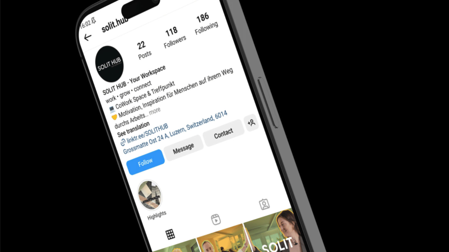
Solit Hub in Littau offers affordable co-working spaces for young businesses. Our digital branding campaign, ‘Create at Solit, Thrive in Luzern,’ transformed Solit Hub’s identity, attracting the right audience through color schemes and a focused strategy.
Services
Graphic Design
Digital Branding
Brand Awareness
Social Media Content
Videography and Photography
CHALLENGES
We promoted Solit Hub’s location in the quieter suburb of Littau, Luzern through creative visuals, engaging the young demographic, and showcasing Littau as part of Luzern to enhance brand awareness in a competitive co-working space market.
RESULTS
We improved the brand’s digital presence through an integrated approach, including targeted social media campaigns and engaging video content. This resonated well with young, creative businesses, resulting in positive client feedback. The project demonstrates the impact of a well-crafted digital strategy on a brand’s image and market position.
Create at Solit,
Thrive in Luzern
Idea to creation
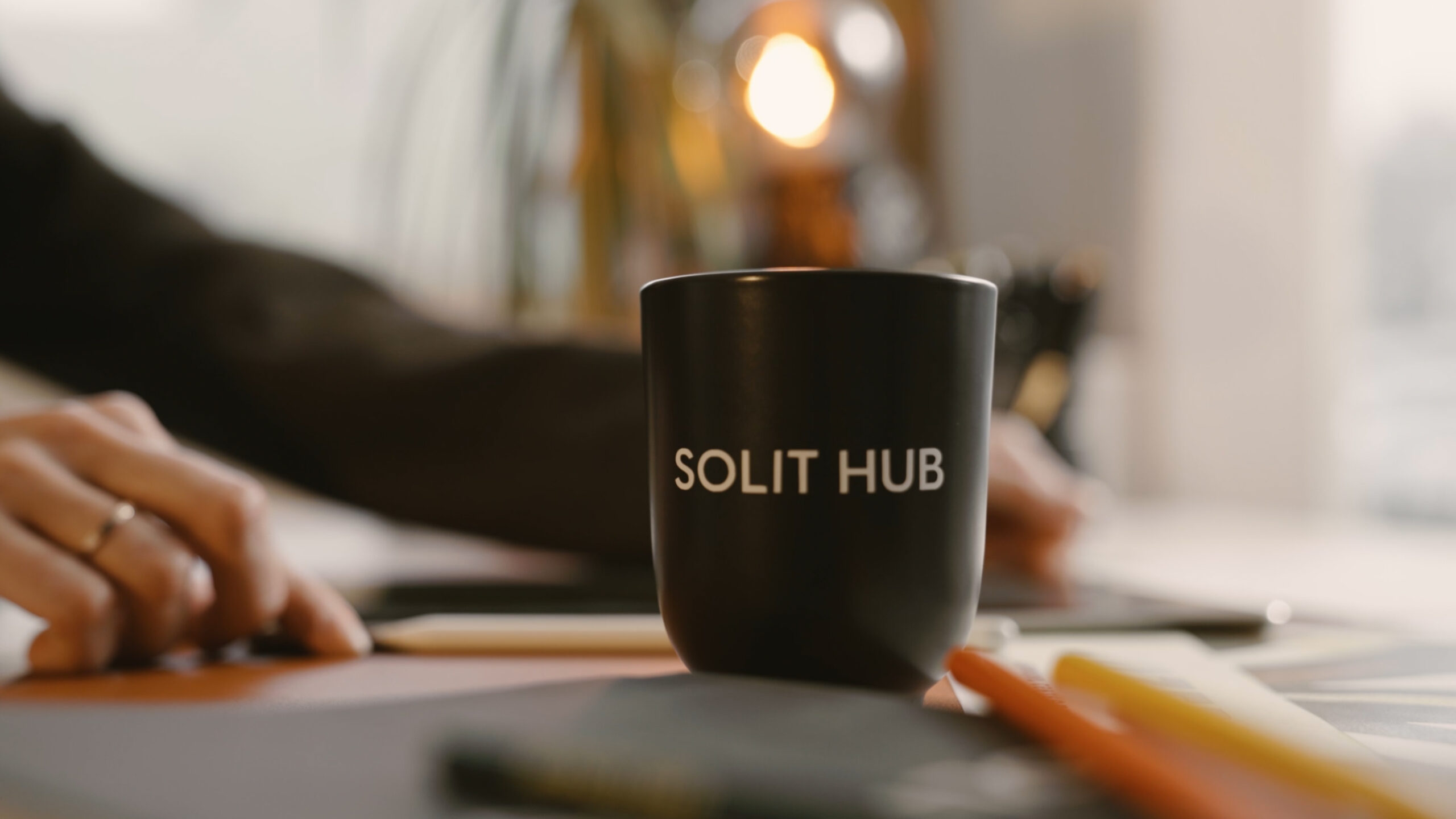
We created a 20-second brand awareness video, designed to be easily adaptable for social media platforms. The video effectively encapsulates Solit Hub’s brand message and identity, making it a versatile tool for various digital channels. The brand identity reflects the slogan ‘Create at Solit, Thrive in Luzern’.
Social Media,
Visual Content
Fun engagement
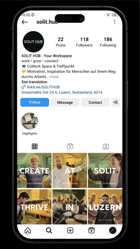
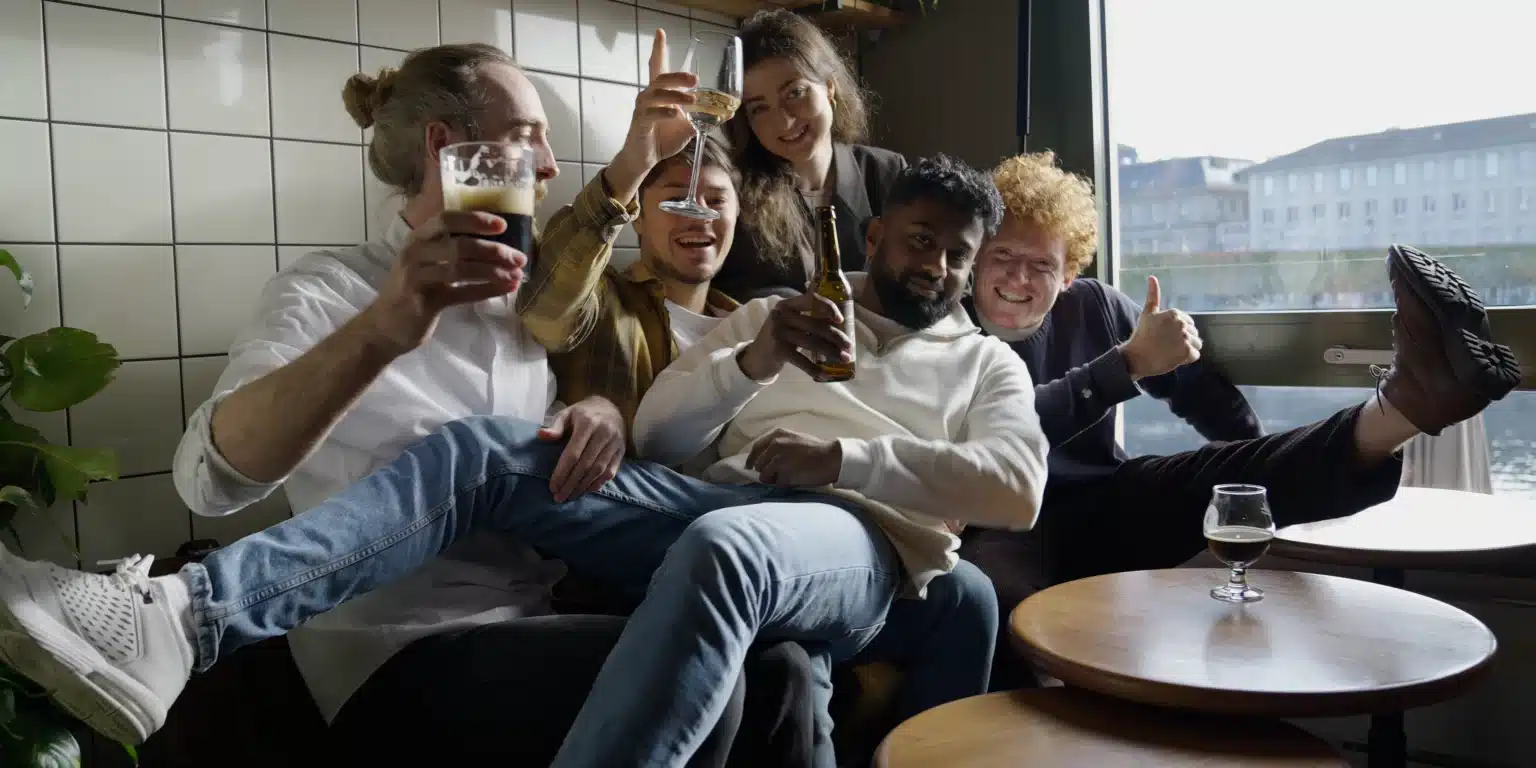
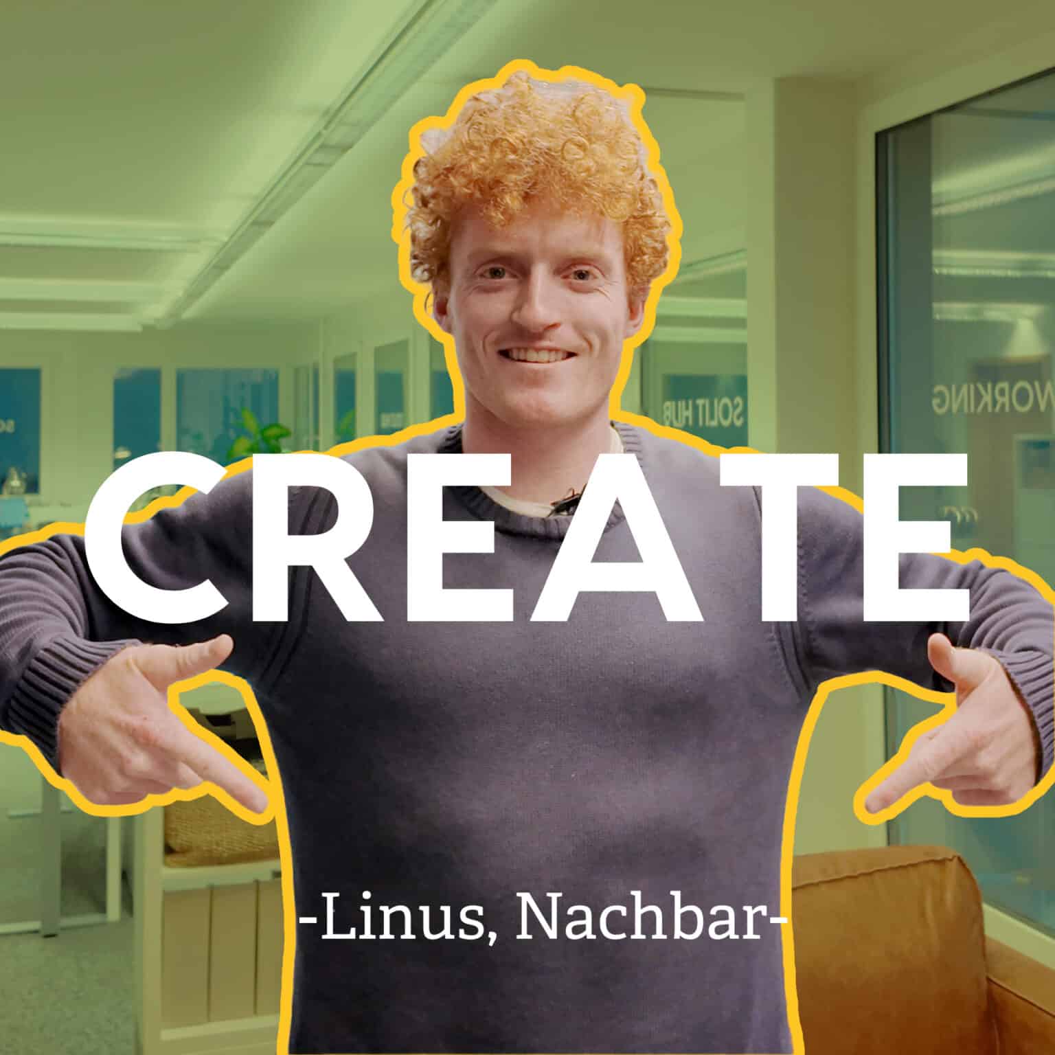
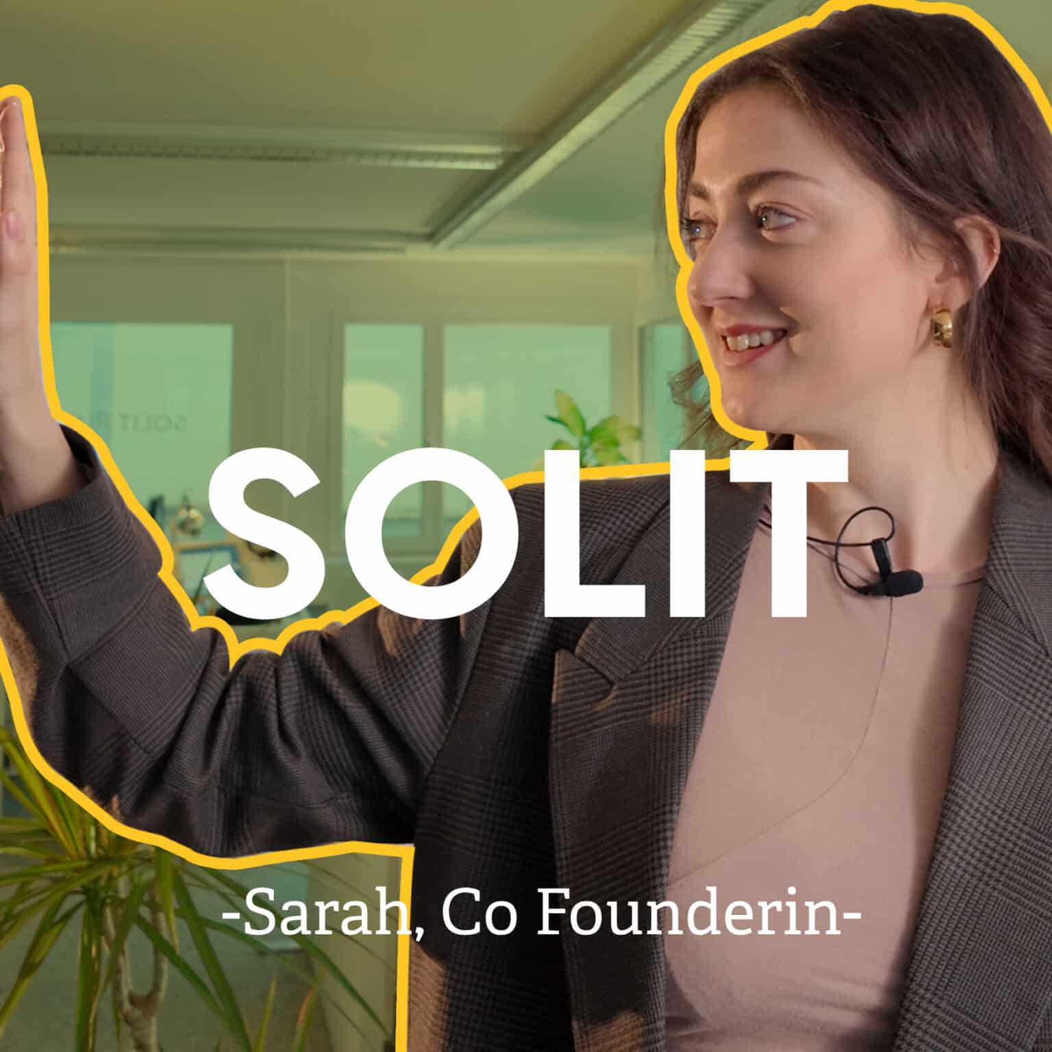
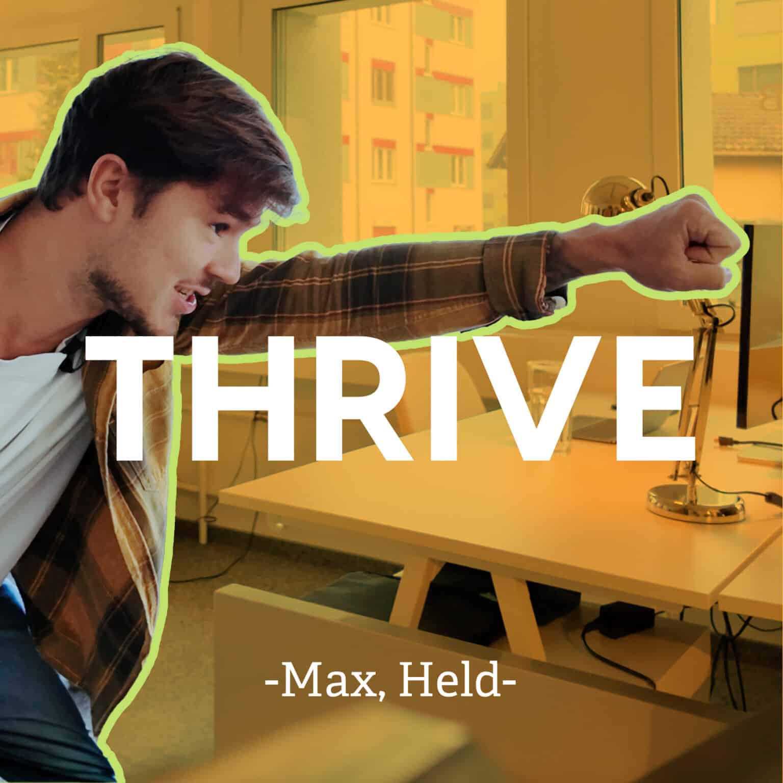
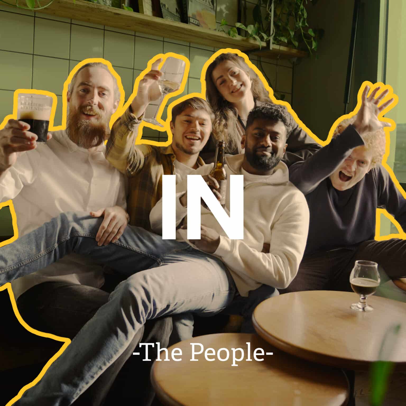
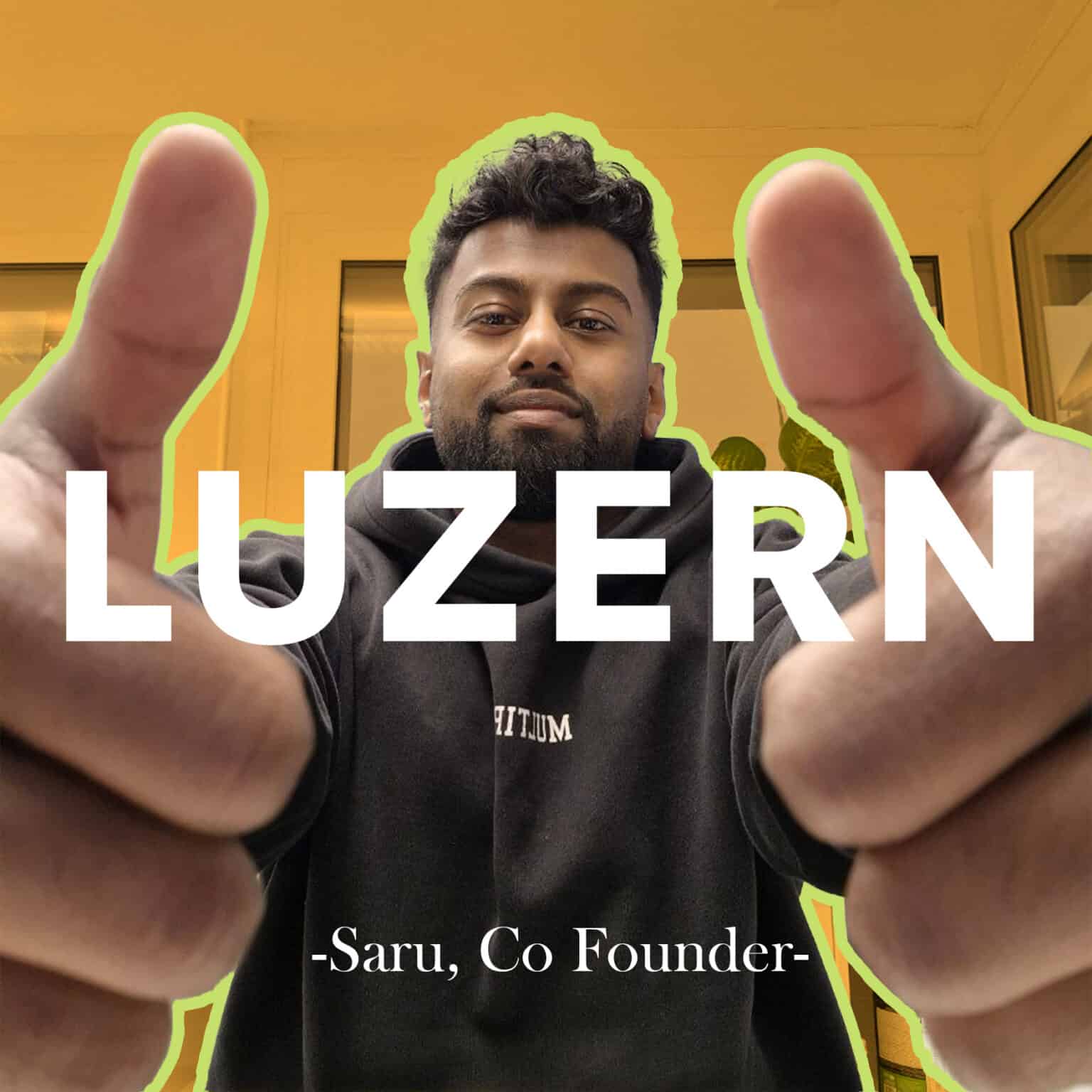
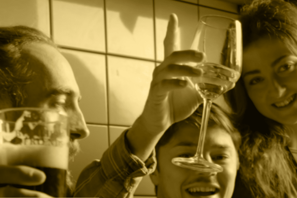
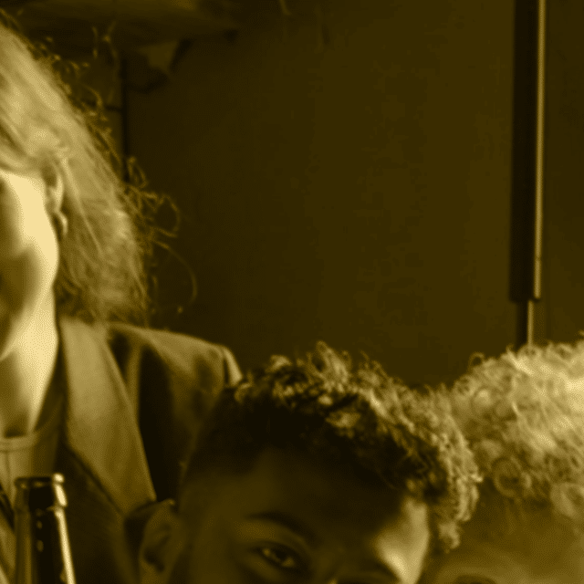
To boost engagement and create a fresh, youthful brand character, we produced six short video posts for social media. These videos featured people answering questions about what Solit means to them, adding an element of fun and personal connection to the brand. This approach not only heightens engagement but also aligns perfectly with the target market of young creative businesses.
The Icon,
Favicon
Favicon
The favicon we created encapsulates the brand’s identity. By incorporating the green color from the palette white color from the logo, and the customized typeface from the Visby font (used in the logo); the favicon serves as a miniature representation of the brand’s visual language. The elements support brand recognition.
The Fonts,
Visby & Adelle
Font Pairing
To improve digital branding, we added a new Serif font, Adelle, to Solit’s existing font, Visby. This pairing of Serif and Sans-Serif fonts is a classic typography strategy. Serif fonts are frequently used for body text because they’re easy to read and have a traditional appearance. Sans-Serif fonts, on the other hand, are perfect for digital platforms and headlines because they have a clean, modern look.


The Palette of
Earthy Vibrance
The Color
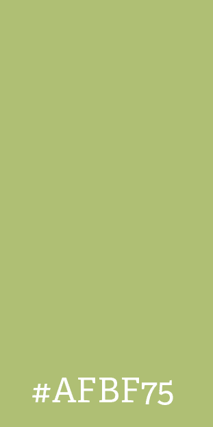
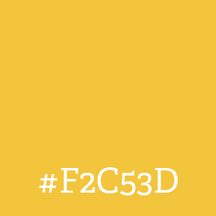
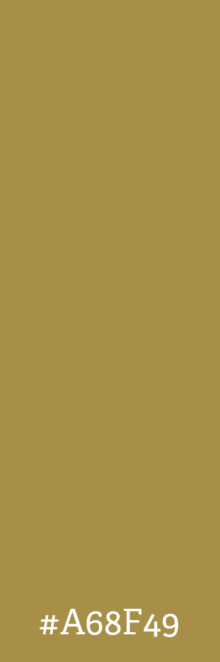
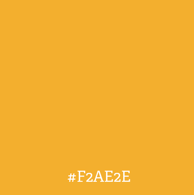
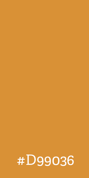
Solit’s brand identity is communicated through a cohesive color palette. Earthy green (#AFBF75) represents growth and tranquility, while bright yellow (#F2C53D) reflects the dynamic spirit of its target demographic. Muted bronze (#A68F49) adds sophistication and warm orange (#F2AE2E) underscores creativity and enthusiasm. Lastly, rich amber (#D99036) portrays Solit as a welcoming space for innovation. These colors enhance the visual appeal and communicate Solit’s values effectively.






Explore more projects
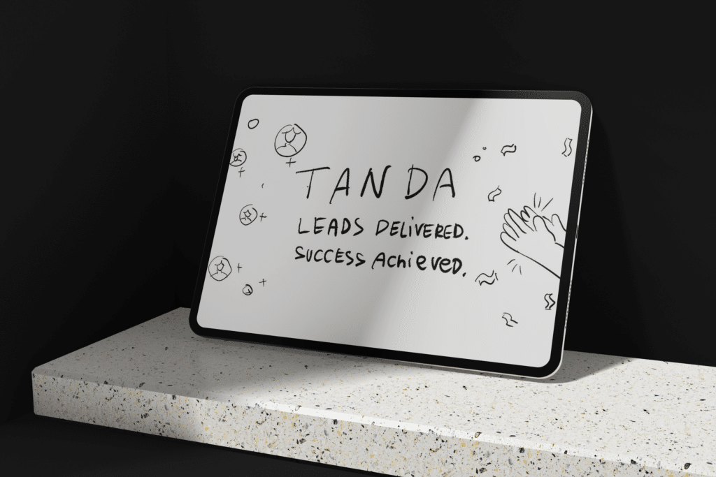
Tanda
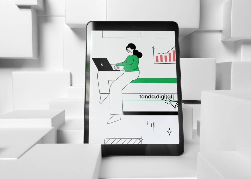
The animation showcases Tanda’s expertise with dynamic visuals that reflect their brand, and informative and engaging script.
BHMS
We conceptualized ‘BHMS – Be The Leader’ theme; which includes a narrative video and a collection of visual materials; showcasing Swiss hospitality education.
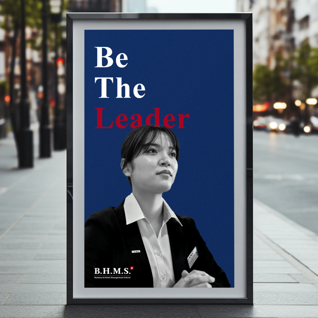
Photo Video
Animation
We transform imaginative concepts into compelling creations for your businesses.

